
Layout Design Basics
Typography in Graphic Design
Good typography is imperative to when you want to translate an idea to another person via text — such as a poster, website, blog post, magazine ad, user interface, billboard, or even a newsletter. Your choice of typefaces and your technique of setting type give your composition its character, pace and style. Not only does it give the copy legibility, it also helps the reader gain a greater insight into the subject of the design. Typography is the art of arranging letters and text in a way that makes the copy legible, clear, and visually appealing to the reader. Typography involves font style, appearance, and structure, which aims to elicit certain emotions and convey specific messages. In short, typography is what brings the text to life.
There are three basic kinds of typefaces: serif, sans-serif, and decorative. It’s best to use a maximum of two fonts in a given design project, and one with a large family is often even better. It keeps your design uncluttered and simple. Try to pair serif fonts with sans-serif fonts, such as putting main body text in a sans-serif font and putting your title in a serif font, or vice-versa. Use decorative or display fonts minimally, and almost never for main-body text, because they often have low readability and just won’t look right most of the time.
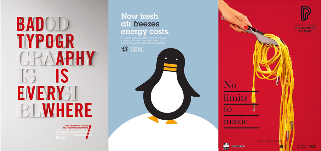
image credit : pinterest
Good typography will establish a strong visual hierarchy, provide a graphic balance to your layout, and set the overall tone. Typography should guide and inform your users, optimize readability and accessibility, and ensure an excellent user experience. If it works in black & white. It will work in colour. The typeface you choose for your website depends on how you want your users to feel when they first enter your website. Do you want to emulate a friendly atmosphere? Do you want the site to feel high-end, welcoming, playful, or serious? It’s imperative that the typography reflects the personality of the brand or product.
The typeface you choose for your layout depends on how you want your users to feel when they first look at your design. Do you want to evoke feelings of joy? Do you want the design to feel high-end, welcoming, playful, or serious? It’s imperative that the typography reflects the personality of the brand or product.
Design Decisions to Consider When Designing for Print
Typography is the art of creating and arranging text to ensure content is readable and appealing. Typography’s history dates back to at least the mid-15th century when Johannes Gutenberg invented a movable printing press that brought the mass-produced Gutenberg Bible to the Western world.
Image Credit : Designinspiration
Tone and Mood: Decide what the tone and mood of the layout should be. Is it formal or casual? Playful or serious? Modern or traditional? Tone and mood can also vary depending upon your end product. For example, a coffee table book will have a different vibe from that of a photobook.
Readability: People often confuse legibility and readability. Legibility is how easily recognizable each letterform is within a typeface. Readability, though, is how easy the typeface actually is to read (especially in large blocks of text) and depends on a number of factors.
Proportion or Scale: Knowing the scale at which you will use the typefaces in your design allows for more informed design decisions. All elements on your page should be proportionate to each other.
Combining Typefaces: Using more than one typeface is a great way to add both visual interest and reinforce visual hierarchy. Creating a layout with a maximum of two typefaces is considered good practise, and one may fuse together even three fonts but you must be a clever fox to pull that off.
Licensing: Font licensing is getting permission from a font creator or distributor to use a particular font in a certain way. Some fonts require you pay a fee to obtain certain usage rights, which involves purchasing the license, while others are free.
There’s an art to weaving words into a design without overshadowing or clashing with the other visual elements. It’s called typography, and its importance in graphic design is inarguable. We often think of graphic design as a computer-age invention. But books, broadsides, and newspapers have been around for centuries, and the quest for tools and techniques that simplify the printing process stretches back just as far.
One of the characteristics of typography design is that it gives personality to a design. Your design looks friendly, or high-end, playful, serious, welcoming, etc because of the strategic use of typefaces. You can use certain typefaces or reflect your brand’s traits. Graphic designers use typography to ascertain harmony when designing for print. A harmonic design has an artistic effect on viewers. The designers use the same font for similar content so that people can recognise it immediately. A picture may be worth a thousand words, but in graphic design, text carries just as much weight as the images it sits next to.☻
Image Credit : Pinterest
Visual Hierarchy In Graphic Design & Art Direction
Visual hierarchy in graphic design & art direction organizes elements to guide the viewer’s eye, leveraging size, colour, contrast, and placement to prioritize information. Visual hierarchy is a design principle that refers to how elements are arranged in a design or a photograph.
Art Directors & Designers use several compositional techniques to create focal points in design and photography. These techniques include the rule of thirds, which allows the focal point to be off-centre; the rule of odds, where an odd number of objects is pleasing to the eye; and implied movement, where objects are arranged to suggest movement. Visual hierarchy guides the viewer’s eyes across the page. Most people will read visual information in one of two ways, which guides designers in arranging page elements to hold the viewer’s attention.
- Alignment and composition to create focal points
- Consider reading patterns & shape
- Colour and contrast draw the eye
- White space creates emphasis
- Scale and repetition creates unity
- Signs & Symbols in graphic design & art direction
- Texture and depth are also important for creating visual hierarchy
Image Credit : Pinterest
You can use digital tools such as mood-boards, style guides, brand guidelines, and personas to visualize and document your art direction. This will help to ensure consistency and alignment across your team as you strive to achieve your goals and convey your message. An art director collaborates with stylists, photographers and makeup artists for shoots and decides on the concept or theme everyone will work towards achieving. Its a bit hectic but totally worth the final outcome.☻
What is the Golden Ratio?
Also known as the golden section, the golden mean or the divine proportion, the golden ratio is basically understood as 1:1.618, and is derived from the famous mathematical Fibonacci sequence in which each number is the sum of the two numbers before it. The difference between any two numbers in this sequence isn’t always exactly equal to 1:1.618 but its rather close.
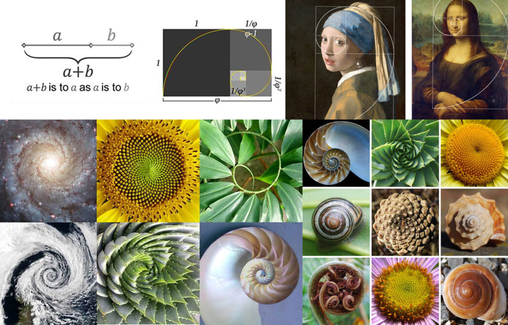
Image Credit : Pinterest
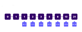
In the 1200s AD, the mathematician Leonardo Di Pisa (or Fibonacci) made some calculations, resulting in a series of numbers now called the Fibonacci sequence. The sequence looks like this: 1, 1, 2, 3, 5, 8, 13, 21… Starting with 0 and 1, you’ll get the next number from the sequence by adding the previous two numbers together. As the numbers in sequence get larger, the ratio between them gets closer to 1:1.618. This is considered to be the Golden Ratio number.
The Golden Ratio is a mathematical ratio you can find almost anywhere, like nature, architecture, painting, and music. When specifically applied to design specifically, it creates an organic, balanced, and aesthetically pleasing composition.
The Purpose Of A Grid In Publication Design
There is a mathematical ratio found both in man-made design and in nature that creates aesthetically pleasing compositions in your design work. It’s called the Golden Ratio. The pyramids of Giza, the Parthenon and da Vinci’s painting of the last supper are all said to be designed and composed within the parameters of this ubiquitous and ancient equation. In design, a grid is a system for organising layout. The layouts could be for print (like a book, magazine, or poster), or for screen (like a webpage, app, or other user interfaces). There are a lot of different types of grid, and they all serve different purposes. Here are some of the main ones that i know and have put into my own practise : –
- Manuscript Grid
- Column Grid
- Modular Grid
- Hierarchal Grid
Publication design refers to the process of creating and designing layouts for things like newspapers, magazines, books, and the online equivalent to those. It includes elements like images, typography, and designers consider things like size and colour to make publications attractive, eye-catching, and easy to take in. Publication design can encompass a wide range of formats, from single-page newsletters to multi-page magazines. Some common types of publication design include: Newspaper / tabloid magazine, books – novels, coffee table books, photo-book, online newsletters, online magazines, e-books, blogs, digital reports, digital catalogues, digital brochures, design inspiration: magazine, web design publications, and many more.
