
TypeMood & Crowds
There are 8 principles to live by when applying text and image in visual design. Images help create a connection with the text and can clarify the information presented in a layout by adding meaning and evoking associations. An image on its own, however, is not enough to be meaningful unless it’s a photograph where the composition is of supreme importance. There are certain elements of typography, which collectively emote various moods in a composition. Below are 8 elements. ☻
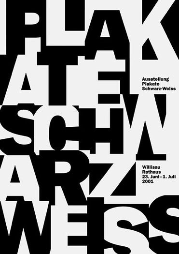
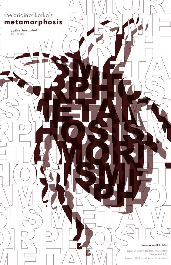
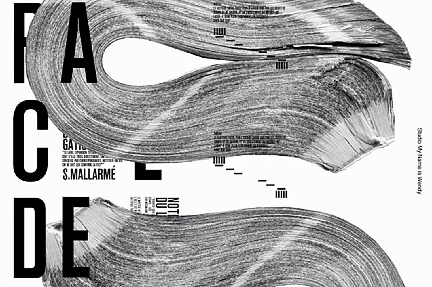
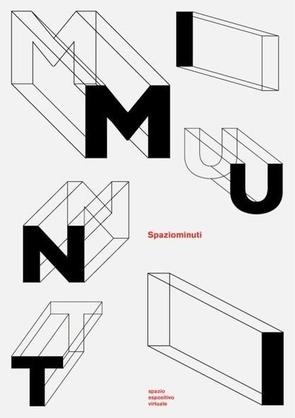
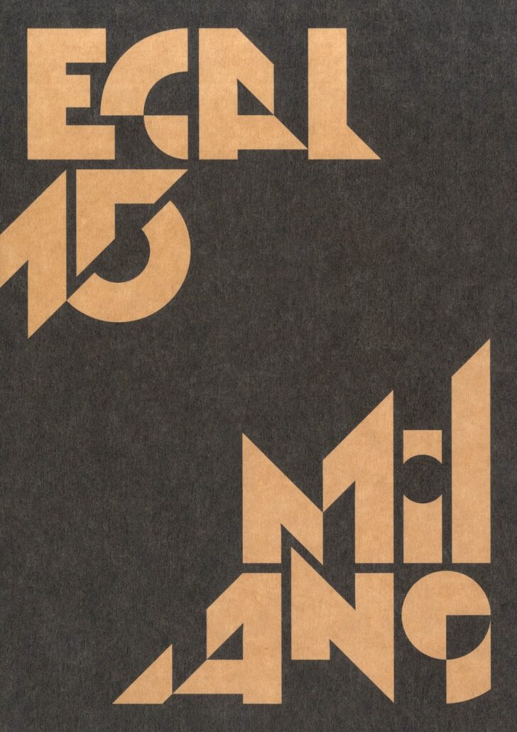
Figure and ground
The relationship of an object and its space, of foreground to the background, contrasting similar to dissimilar, activating the whole composition. The prime factor of the composition is its white space. i.e. the space that is not filled with text blocks, images or graphics. The white space is actually the most misunderstood mood of typography. White space is a deciding factor as to whether the composition is neat or messy.
The white space or negative space can be highlighted through the use of scale and even color. But color is a crazy subject, so I shall address that in my next post in grave detail.
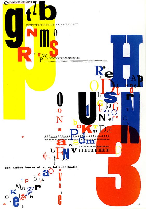
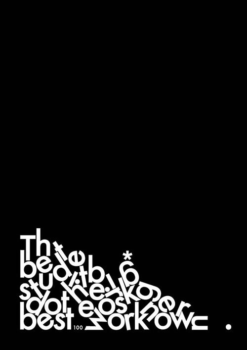
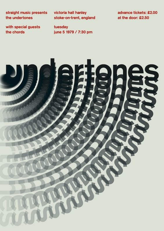
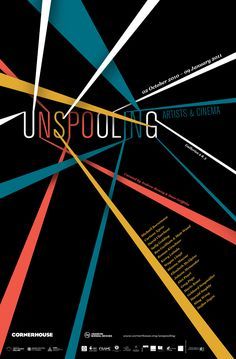
Active
A composition where a rhythm and proportion emerge to keep the focus within the elements. An active page layout with type blocks and just singular type isn’t that much of a biggie. But to place each element (type) in its rightful well-deserved spot is the magic act. One can even use kerning and leading to find space and re-create the composition. An active page layout often evokes emotions of joy and happiness.
Passive
A composition where no emotions are evoked, but at the same time a focal point is maintained within the composition. The elements within the composition are connected in a subdued, obedient and docile state. A passive page layout will not have any eye – movement nor any focal point. Passive composition can be mistaken for a boring page layout, but it’s just as simplistic as a layout of text blocks, type and graphics.
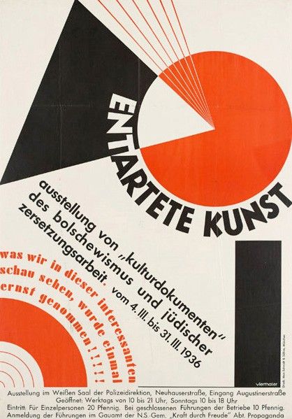
Symmetry
This composition creates stability and order. There is no tension in any elements of the composition. Symmetry is formed when all the elements of the composition are equal in scale and proportions. No element is out of its place, and that the visual is complete in itself.
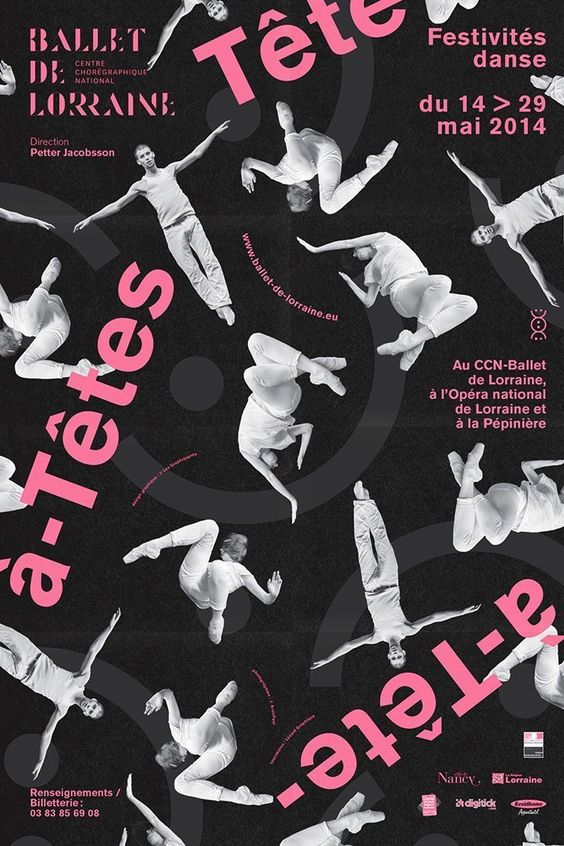
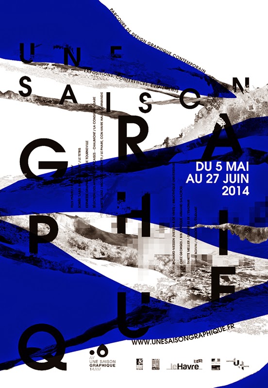
Asymmetry
An asymmetrical composition is dynamic and there is an informed use of white space. There are unequal and uneven shapes which are formed due to positioning of the elements inside the composition.
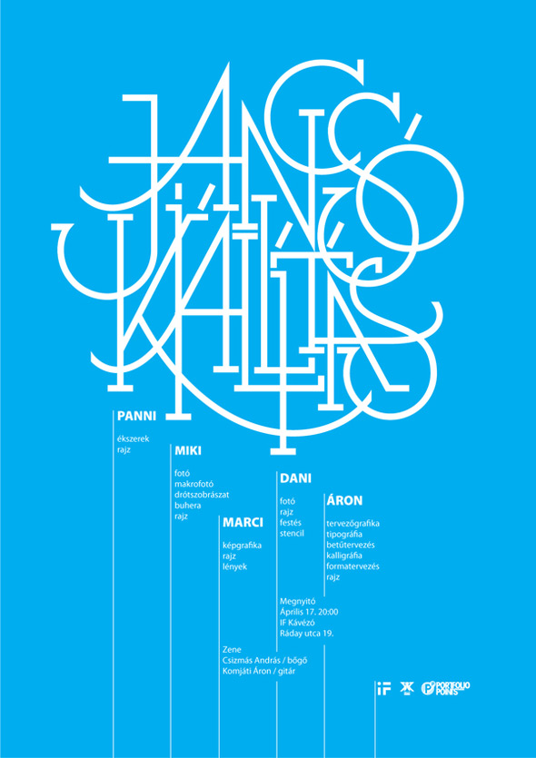
Grids & Margins
This composition defines the structure of its elements. The use of columns, grids, margins, horizontally and vertically, to make sense of information. One can use this principle to organise heaps of information.
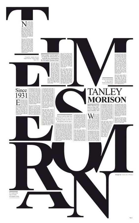
Hierarchy
The establishing of order and emphasis, from an understanding and manipulation of the content, within a composition. Hierarchy is achieved with the prominence of the typographic elements relative to each other. You’d first have to start with a focal point or a visual anchor, within the composition or page. Then gradually design the layout; place the other elements after thorough speculations over the scale and the movement of the eye. You’d want your composition to have the right rhythm and proportions.
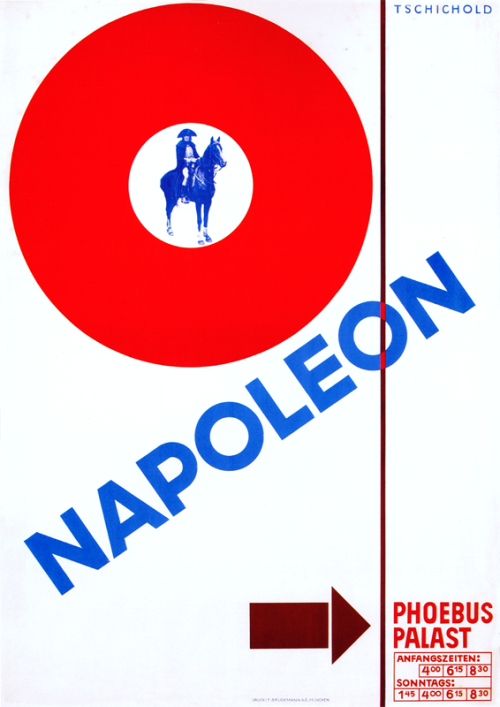
Visual anchor
This design principle establishes an immediate focus within a composition, and a point around which the design is oriented. Any one element is either magnified or reduced to create drama within a composition. How you decide to weave all elements together, is really your call as a designer.
There are various examples where we can apply the principles of text and image in visual communication. However, in print design the principles are applied differently as opposed to the web space, simply because of legibility as it affects the reader’s ability to read, and in typography the main thing to remember is that the user must be able to read what’s in front of them.